opinion

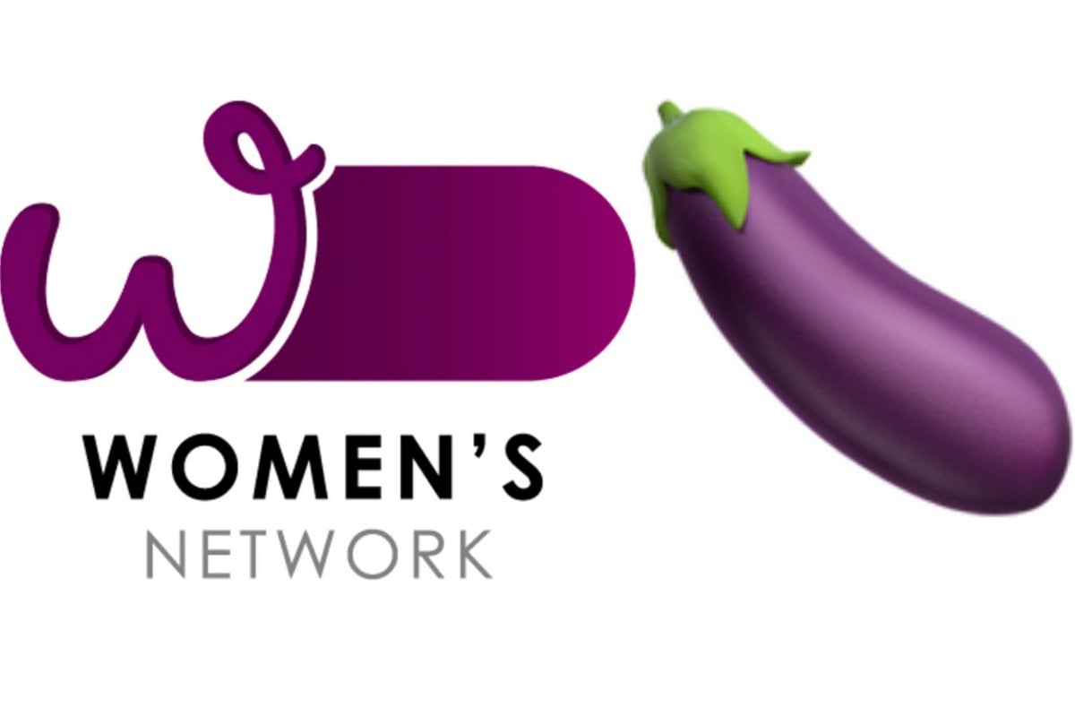
The government was tasked with designing a Women's Network logo. Here's what happened.

Adrienne Tam
Adrienne Tam
Senior features and opinion writer
March 15, 2022
Share
Leave a comment

You might have seen a big, fat purple penis in your news feed over the last day or so and thought, "Have they updated the eggplant emoji?"

But no, you'd be wrong. It is, of course, the federal government's new Women's Network logo.

As you can imagine, people have noticed that this new government initiative, which promotes gender equality and "champions equal opportunity", has a logo that looks like genitalia. Even international media have noticed! Which means that's a big boo-boo indeed. Other organisations that have the words "Women's Network" in their names have sought to distance themselves from this whole mess.

I thought this was satire, but it is either thoughtless or an insult. Public money was spent getting a graphic artist, choosing the designing, selecting colours, approving, printing and publishing this logo for the Prime Minister's and Cabinet's Women's Network.
Poor messaging. pic.twitter.com/jDYKNdMCkg
— National Older Women's Network Australia (@OlderWomenNetAu) March 13, 2022

Logo for Australian government's 'Women's Network' roasted on social media https://t.co/l5lNniV7N6 pic.twitter.com/0vtiVJDMKN

— New York Post (@nypost) March 14, 2022

Please be advised that Women’s Network Australia has been around for 30+ years. This is our trade marked logo. We are in no way affiliated or associated with another #womensnetwork organisation and logo, the design of which has been subject to much comment. pic.twitter.com/6lx2EBxGRL

— Women's Network Australia (@WNAAUS) March 14, 2022
Adrienne Tam
Adrienne Tam
Senior features and opinion writer
March 15, 2022
5 Comments
Listen Now
00:00

Injectables Have A Brand New Hype Guy

Mamamia Out Loud

Australia’s Highest Paid Escort Has Quit

No Filter

Evening Headlines: Young Girl Awarded For Saving Her Mums Life

The Quicky
ADVERTISEMENT

Since the federal government rarely make mistakes when it comes to women (!), we here at Mamamia decided to do a deep investigative analysis into how Penis-gate unfolded. Using pretty much just our active imaginations, the following is a play-by-play on the latest scandal to hit the highest office in the land. (If it's not clear already, the following is satire). 

Monday 11am, Parliament House, meeting room codenamed Sylvester Stallone.

A number of mostly white-haired, balding middle-aged men sit around a large table in the shape of a penis to discuss the important issues facing Australians today.

"So we all agree: the snack we should bring back is the Tubba Bubba Squeeze Pop?" nameless man 1 asks.

"Yes!" the men chorus.

"Do you think we should talk about the floods too? And Ukraine?"

"But that will take ages and it's almost lunch-time!" 

"Why are we having this meeting so early?" nameless man 2 whines. 

"So that head nameless man can go to his ukulele gig at 12," nameless man 3 replies.

"Where IS head nameless man anyway?" asks nameless man 4.

Suddenly head nameless man comes running into the room. "Sorry I'm late!" he says. "I thought we were meeting in the Arnold Schwarzenegger room. My secretary must have put the wrong location into my calendar. She's not very bright, but she's the same age as one of my daughters and therefore I feel empathy for her."

All the men nod in agreement.

"Speaking of women," says nameless man number, er, 5? "We have some options for the logo for the Women's Network."

ADVERTISEMENT

Head nameless man furrows his brow. "The what?"

"The Women's Network? The new initiative for gender equality?"

"Oh, yes!" head nameless man says. "Should I ask my wife what she thinks? I ask her about women's things all the time because she's a woman."

"I like the big, fat purple logo the best," nameless man 6 says. "For some reason, I really like it. It reminds me of something but I can't put my finger on it."

Nameless man 7 spreads out all the logo options on the penis desk.

"Who did these? They're fantastic!" head nameless man gushes.

"A young graphic designer with no experience," says nameless man 7. 

"I love the big, fat purple one too," says head nameless man. "But don't you think the big, fat pink one would be better? Women love pink."

"But that's why women will hate it," pipes up nameless man 8. "They will think we're pandering to them. We have to be really careful with women's issues since, you know, we don't want to appear insensitive and stupid."

All the men nod. "You are so smart, nameless man 8," says head nameless man. "I will promote you to the leader of the Women's Network."

Nameless man 8 preens.

A woman enters to serve them all coffee. "Hey, you're a woman!" head nameless man says to her. "Maybe, since this logo is about a 'woman's' network, we should get a woman's opinion."

"And that's why you're the head nameless man!" the nameless men chorus.

The woman looks at all the penis logo options. "But... they all look like penises," she says, appalled. 

"WHAT?" The men exclaim. They take another look at the logos and laugh.

"I have no idea what you're talking about," the head nameless man says. "It looks nothing like a penis. And I should know."

The woman leaves. "Why don't we err on the safe side?" nameless man 9 says. "Why don't we get a second opinion before we release the logo to the public? We don't want to be ridiculed for getting the logo wrong - although it is very unlikely since all of us men in this room agree that the big, fat purple logo is the best."

"Good idea," head nameless man nods sagely. "Let's ask Barnaby Joyce."

Meeting concluded at 11.50am, just in time for head nameless man to attend his ukulele gig.

UPDATE: The penis logo has now been pulled [pun intended].

Want to have your voice heard? Plus have the chance to win $100? Take our survey now.

TAKE SURVEY ➤

Sign up to Mamamia Daily.
Your top news stories of the day, in your inbox every weekday.
*By signing up you accept our privacy policy

Related Stories

Related Stories

Tags:
  • australian-news
  • news
Share
Leave a comment
Newsletter

Top Comments

A
arishma.s 4 months ago
Reply
Upvote
I laughed and cried at the same time. Bravo Adrienne Tam for showing the lack of thought process in creating the logo. 

gu3st
gu3st 5 months ago
Reply
Upvote
1 upvotes
Its hard to swallow. The gall, that is. No wonder it met with stiff resistance. I hope they're not too hard on the designer, because he's really blown it this time.   It'll be hard for him to get back up after this mess.
  • Mamamia on Facebook
  • Mamamia on Instagram
  • Mamamia on Pinterest
  • Mamamia on Twitter
  • about
  • contact
  • advertise
  • privacy
  • competitions
Resources
Very Peri
Skin
News
General
Opinion
True Crime
Politics
Sport
Explainer
Entertainment
Celebrity
Reality TV
Movies
TV
Books
Rogue
Royal
Lifestyle
Beauty
Fashion
Weddings
Home
Wellness
Health
Fitness
Travel
Food
Family
Before The Bump
Pregnancy
Baby
Kids
Teens
School
Parent Opinion
Work & Money
Money
Finance
Career
Lady Startup